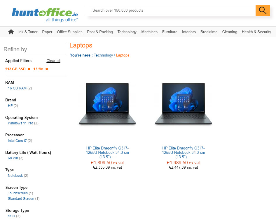
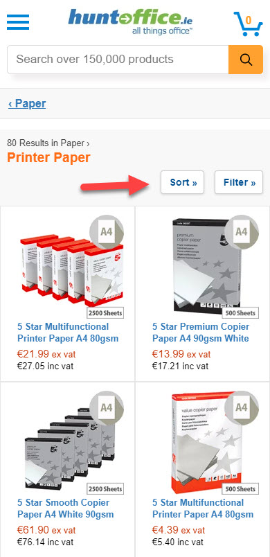
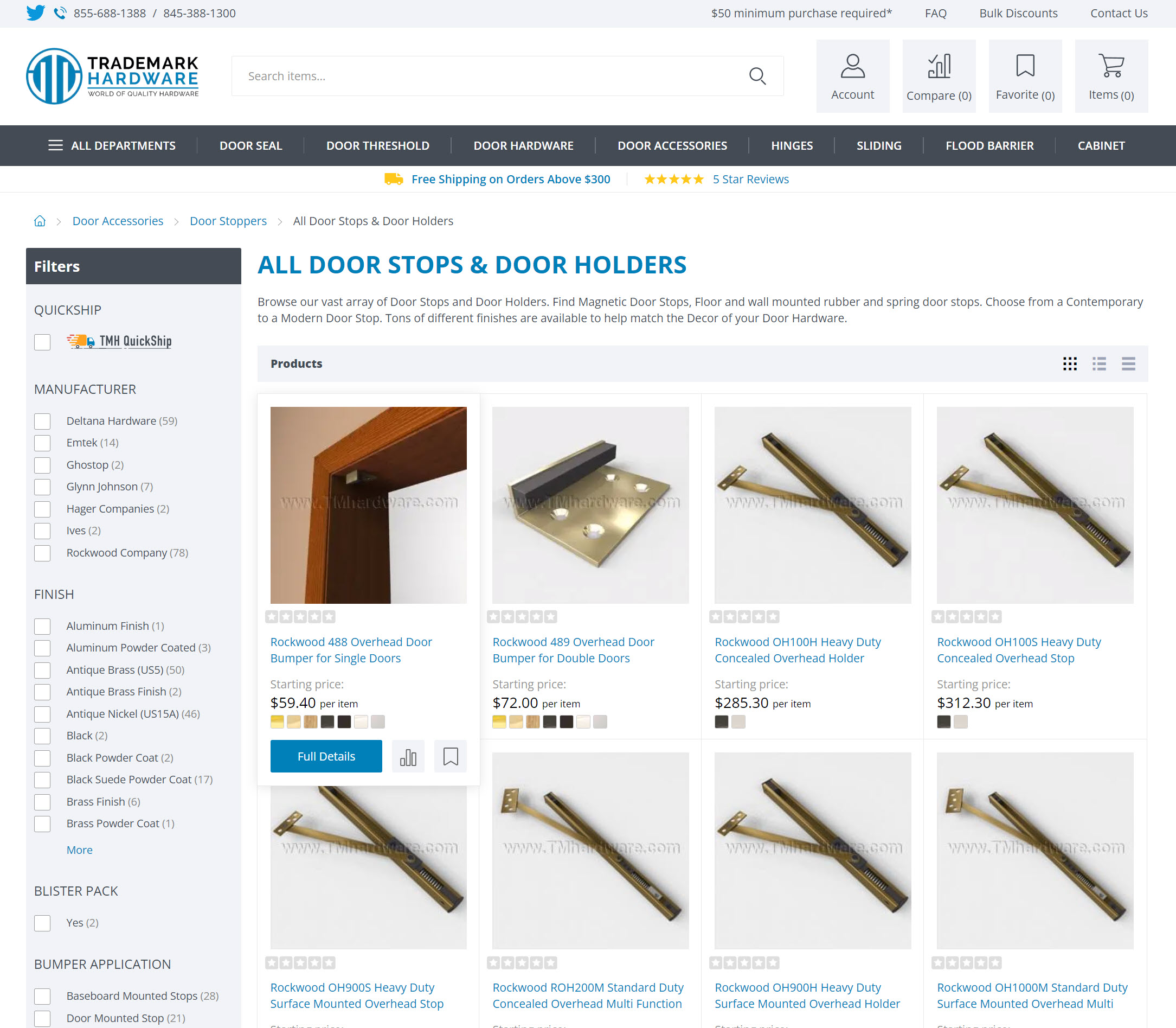
1. Using filters is essential in most online stores. These filters must be based on attributes your users care about (like color, size, price, etc). The most common location for the filters is on the left side of the page, but sometimes they can be at the top – this is something to test if you have enough traffic. Be careful not to mix up filters and sorting options. Most people will expect the filters to be on the left side of the page and your sorting options at the top of the product listing.
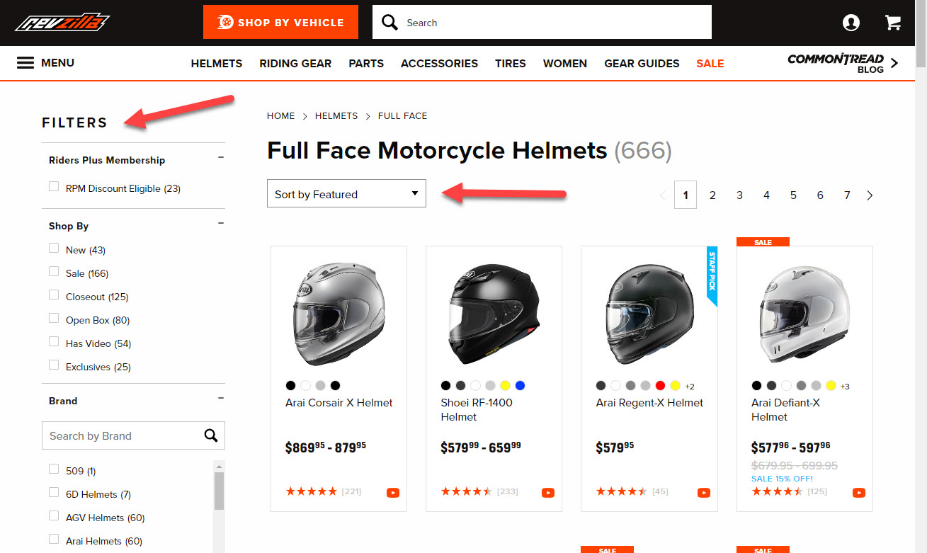
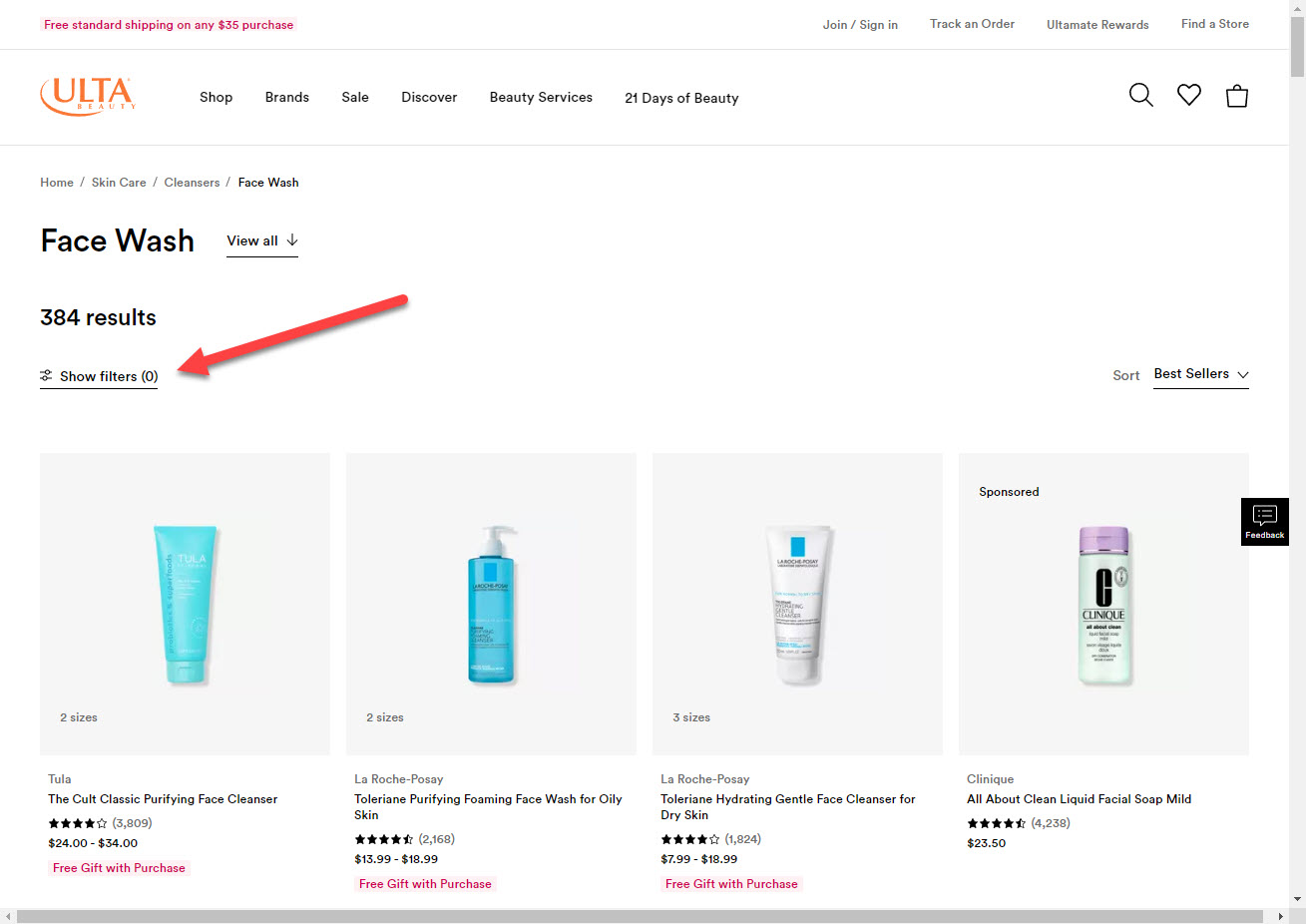
2. Don’t hide the filters on desktop devices behind a button that says “Filters”. This may be necessary on mobile to shorten the page, but on desktop, you want people to access the filters with the minimum number of clicks.
3. After selecting a filter, users should be able to undo this selection by clicking the browser’s back button. Each filter option should be a separate action in the browser’s history. This may not be possible or feasible due to the functionality of your e-commerce platform but if you have an option, consider having that in your store.
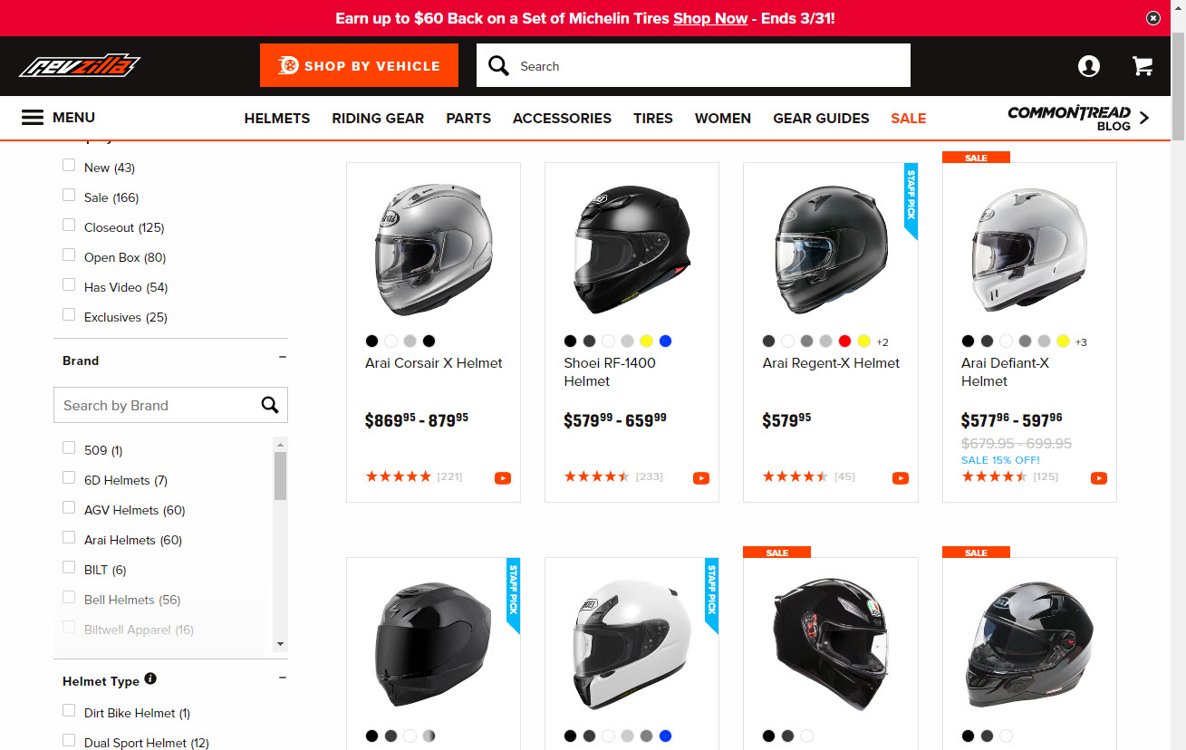
4. Labels like “new” or “on-sale” will help narrow down some visitors’ choices. These can help some items stand out, but you must be careful. Putting the same label on almost everything will only distract your visitors and will not help them decide what to buy.

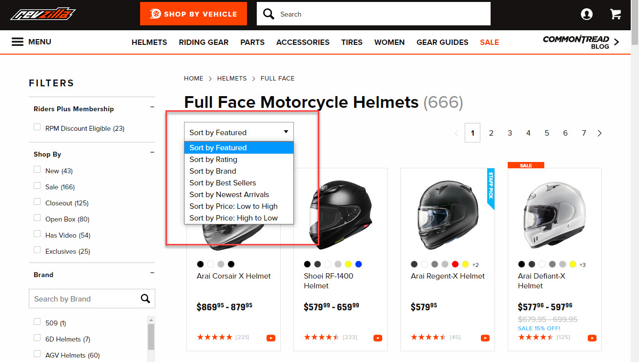
5. Sorting by alphabet is a common method, but it does not help with the selection in most stores and can be removed. The default sorting can be “sort by best-sellers” instead of “lowest price to highest price” because these options are a form of social proof. People will normally consider the most popular product the safest choice because so many others have bought it. Also, you don’t know who recommended it if you use a sorting option like “recommended.” You could also have a sorting option like “most reviews,” which could help in some cases. Most of the time, the sorting options are above and to the right of the list of products
6. Do not remove sorting and filtering options on mobile devices because “there’s not enough room.”. On a mobile device, users are very task-oriented, and removing the filters and sorting will make it pretty much impossible for them to find the right product if they have more than a few listed in a category.
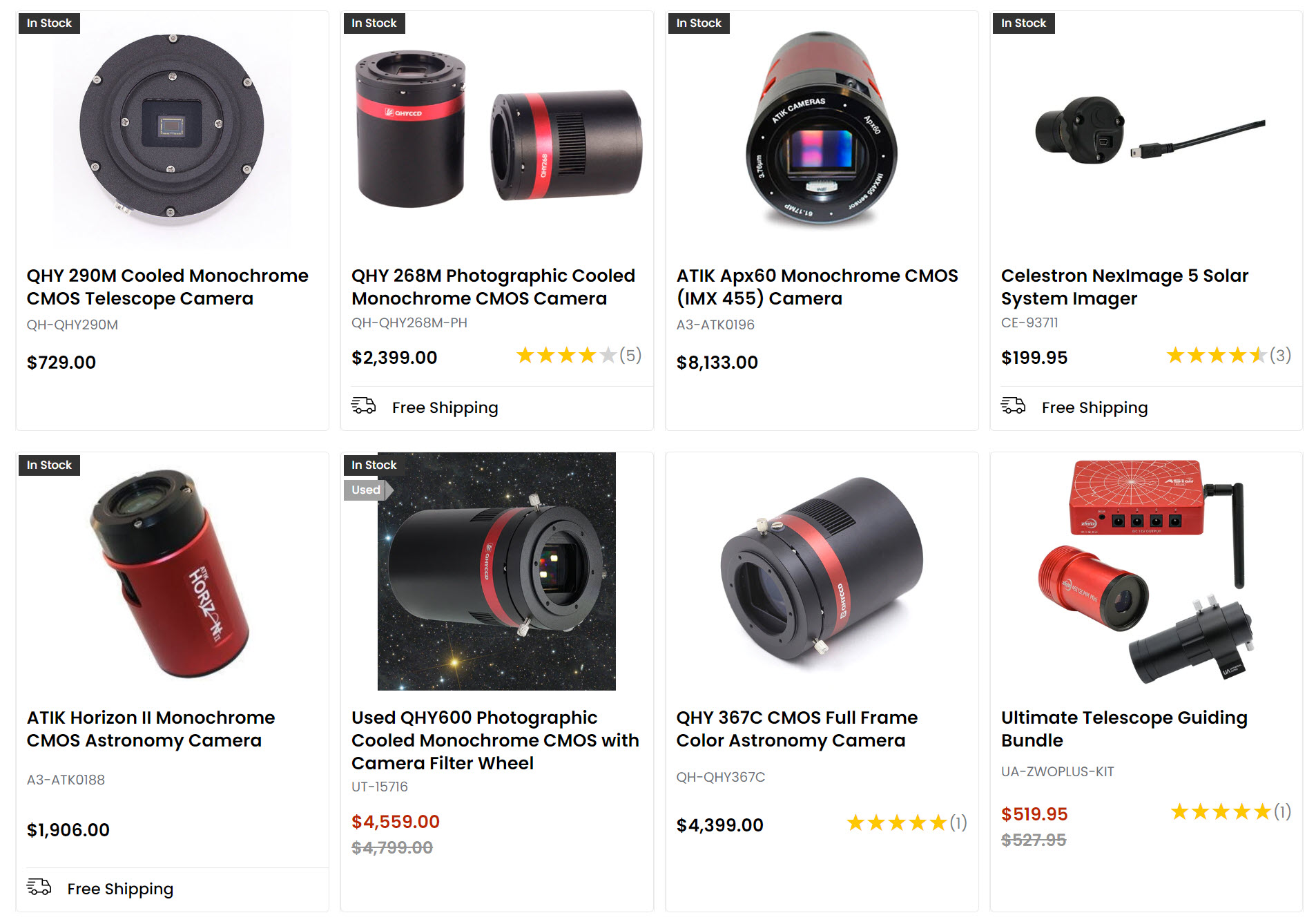
7. Good quality product photos are crucial. To sell things with a small or bad picture or no pictures, you must offer that item at a huge discount compared to your competitors to get a sale. Bad product image subconsciously translates to bad product quality in the user’s mind. Consider setting up a photo studio or use an AI service like Booth.ai to create awesome product photos for your store.
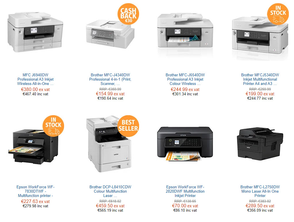
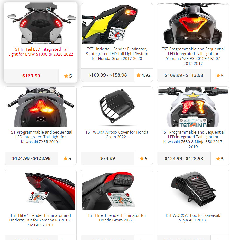
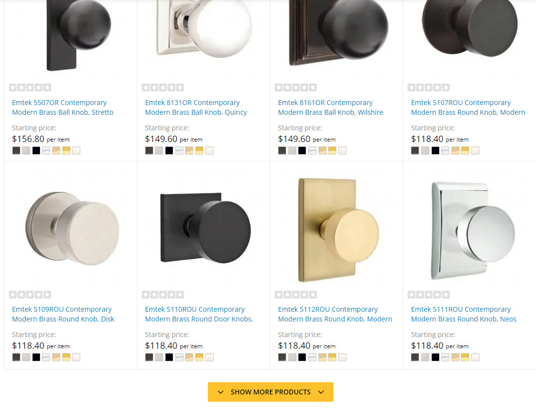
8. Do not show too many products in a row. Tests show three or four products in one row work best on a desktop and one or two on mobile.
9. For some types of products, it’s beneficial to show a different view of the product on mouse-over or a click on a slider control to show a different view of a product variation. This way, a user doesn’t have to go to the page for each product, and it saves a lot of trouble and makes choosing a lot easier
10. In most stores, having a “buy now” or “add to cart” as CTA under each product on the category page doesn’t make sense. Most of the time, people will want to go to the product details page first to know more. Usually, “See details” or “More info” is a better call to action on the category pages. Not having a call to action under each product is also acceptable because the majority of users know to click on the product to see the details.
11. Customers should be able to click on the photo, product name, and description to go to the product details page.
12. Do not hide the product price on the category page. People always have a price in mind, so make visitors go to each product page to see the price, they will give up quickly. If a product has options, show the “From $$$” or the price range “$$ – $$$”
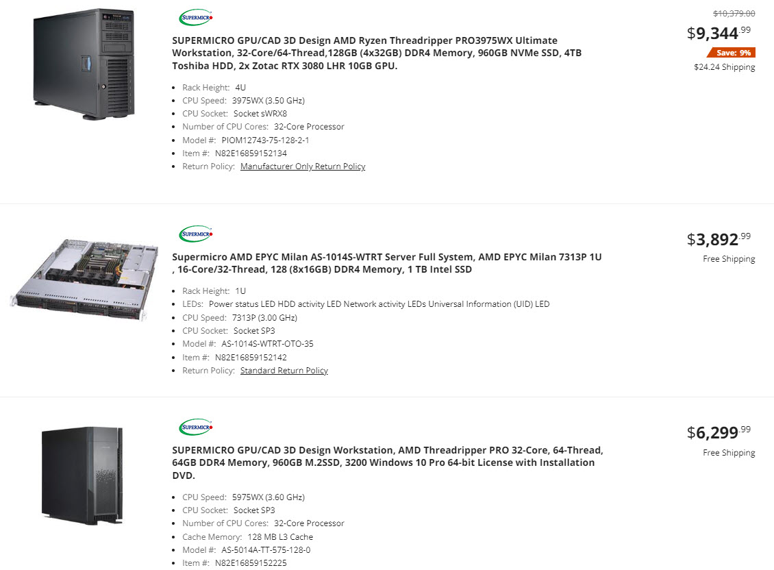
13. Consider your product type when choosing between List vs. Grid View. Grid view works best for “visual” products like furniture, clothing, etc. The list view (1 item per row) is better for products with a lot of information, like electronics or industrial items, so people can see a lot more details for each product without having to go to the product page.
14. When choosing between pagination and infinite scroll, consider how many products you have in a category. Endless scrolling keeps people interested and makes it easier to keep looking (especially on mobile). But if there are “infinite” listings, it can lead to a paradox of choice and stop people from selecting and clicking on any product. Also, some people will want to look at the footer for certain information (like the “about us” page or “delivery and returns” page), and if you have a lot of products, they may not be able to get to the footer at all. If you choose pagination, consider a “show more” to load the next batch or “see all” button at the bottom so people can load all the products to the same page.
15. Showing the product ratings on the category page is as essential for the conversion as showing the ratings on the product pages. It will help users select which product to click on to see more details, moving them closer to the order.